It happens every day: A potential client walks past your salon, glances at your window display, and… keeps walking. Sound familiar?
With a salon on every corner vying for clients’ attention, your promotional design strategy can make the difference between standing out and blending in.
Whether you’re creating window displays, retail promotions, or in-salon signage, mastering these four proven design principles will transform your salon promo ideas and marketing materials from forgettable to impossible to ignore.
Play the short…
…and watch the full episode 53 of Marketing 100 with salon marketing experts John and Kayle as they as they share insider tips for designing promotional materials that convert.
Continue reading below for our detailed breakdown of four essential design principles, real-world examples from successful salons, and expert placement strategies.
🚀 Plus, download our free Salon Signage Success Checklist to start creating more effective promotional materials today.
1: Simple Salon Signage Design (The KISS Principle)
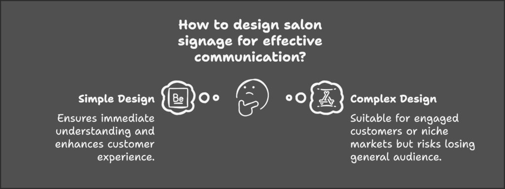
Ever walked past a sign and completely missed its message? Your clients face the same challenge. The golden rule is simple: if someone can’t grasp your message from 10 feet away in half a second, it’s too complicated.
The Science Behind Simplicity: Research shows that high visual complexity in retail settings can negatively impact customer pleasure and decision-making, especially when customers are casually browsing rather than actively searching for a specific service.
However, this research revealed an interesting exception: the negative effect of complexity diminishes for highly engaged customers. This suggests that if your salon caters to a specific niche or offers specialized services, you may have more flexibility with complex designs for your target audience.
For general promotions though, keeping materials clean and straightforward will enhance the customer experience.

What to include:
- One clear, primary message
- Essential details only
- Easy-to-read fonts
- High contrast colors
What to avoid:
- Multiple competing messages
- Lengthy explanations
- Hard-to-read decorative fonts
- Busy backgrounds
If you’re using Paint, if you’re using Word, if you’re using something that’s not a professional graphic design program to make promotional materials, stop doing that. Your clients can tell the difference, and it affects how they perceive your promotions.
Pro Tip: Even if your brand has a signature font that looks amazing, always prioritize readability. Consider accessibility too, your signage should be clear for everyone, including those with visual impairments or color blindness.
For more comprehensive marketing strategies, check out our guide to effective salon marketing techniques.

2: Creating Attention-Grabbing Salon Displays
Having worked with beauty industry giants like P&G and Wella, I’ve learned a crucial concept about promotional design:
At the big brands, we called it ‘the stop effect.’ You need something that visually makes people stop in their tracks, so they actually read your message instead of walking right past it.
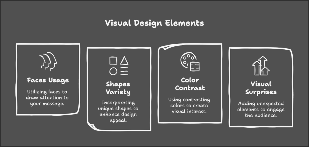
Effective stop effects include:
- Use of faces (especially those looking toward your message)
- Distinctive shapes (think beyond the standard rectangle)
- Contrasting colors
- Unexpected visual elements
A Real-World Example from Kayle:
“I used to work at a salon that had a lightning bolt as their logo. That makes for excellent signage because it naturally draws the eye to the point of the lightning bolt. If you’re going to create a shape and you want it to point to something, that’s perfect. It fits exactly with their image.”
Expert Tip for Shape Selection:
- Round signs stand out in spaces dominated by square displays
- Arrows or directional shapes can guide attention to specific products
- Unexpected shapes break the visual monotony of traditional retail spaces
These display principles work especially well when promoting salon retail products.
↓ Pin it for Later ↓

3: Salon Marketing Design Layout Strategy
Think of your salon advertising like a visual story that guides the eye. Professional designers arrange elements to guide viewers naturally through your message.
Where you place your promotional materials matters. Studies show that displays near your main service areas (like styling stations) get the most attention. Eye-level, front-facing displays are best for promoting new services or special offers, while shelf-level displays work better for showcasing specific products.
Key layout principles:
- Make your main message the largest
- Use size differences to indicate importance
- Place supporting information in smaller text
- Follow natural eye movement patterns
- Align visuals (like model photos) to point toward your message
The Face-Direction Rule: When using images of people in your promotional materials, a simple but powerful trick is to have the model looking toward your text. As Kayle explains:
A face and a message are always tried and true… making sure that face is looking at the message and not looking away. It’s a really simple thing, but it actually makes a difference.

4: Salon Promotional Material Placement
Even the most beautifully designed salon retail promotion will fail if it’s in the wrong place. Consider your clients’ journey through your salon and their mindset at each point.
Someone walking by your window is in a completely different headspace than someone who’s been in the chair for an hour.
Digital vs. Physical Displays: Both types have their place in your salon. While digital screens offer flexibility for updating content, traditional physical displays tend to be more memorable. Consider using both: physical displays for key promotions and digital screens for dynamic content like before-and-after transformations.
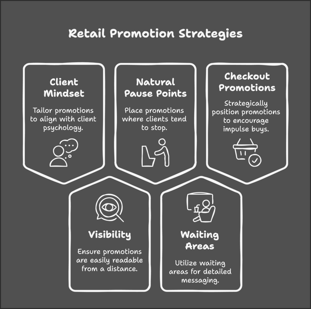
Placement tips:
- Match promotions to client mindset at specific locations
- Consider visibility and reading distance
- Place retail promotions where clients naturally pause
- Use waiting areas for longer-form messaging
- Position checkout promotions for impulse purchases
Here’s a tested promotion idea from Kayle’s experience managing a salon:
Every year, we’d have this Easter egg hunt for a few days around Easter. We’d hide eggs throughout the salon containing special discounts and promotions. People loved going and looking for the eggs and bringing them up to see what discount they got.
This strategy worked because it:
- Created excitement and engagement
- Encouraged exploration of the salon space
- Turned promotional material into an experience
- Made discovering discounts fun and memorable
- Prompted unexpected retail purchases
Like perfectly placed highway signs, your promotions should appear at key moments in the client journey.
Start with the initial entrance experience, where first impressions matter most. Then, capitalize on natural browsing time in the waiting area, where clients are most receptive to new information.
During service is your opportunity for personalized promotional conversations, followed by strategic post-service retail opportunities.
Finally, don’t forget the checkout interaction – this last touchpoint is perfect for promoting future visits or special offers.
Common Mistakes to Avoid:
- Using amateur design tools instead of professional software
- Overwhelming clients with cluttered messaging
- Misaligning promotions with the natural client journey
- Overlooking strategic placement opportunities
For more cost-effective marketing solutions, explore our DIY salon marketing guide.
Turn Your Salon Marketing Into Results
Great salon promotions blend artistry with strategy. By following these design principles, you’ll create materials that not only look professional but drive real results. Start implementing these changes today, test their effectiveness, and adjust based on your clients’ response.
🚀 Download our free Salon Signage Success Checklist to ensure your promotional materials hit all the right marks.
P.S. For even more proven salon marketing tips, don’t forget to check out the rest of our Marketing 100 series.
